

When Astra came out, I started seeing it right after, first on Instagram, then on TikTok and other social media.
I’ve seen people copying the whole Minecraft game with it in just a couple of hours. GTA 6 and similar stuff. Mostly pretty fun stuff, but nothing useful.
So I started thinking, what can I use Astra for in marketing? Which clients, what can it help me with?
It’s the biggest and the best model so far, so I focused on the video. The most time we spend on with my team is the video. We’re struggling the most with the video.
Can we do a promo video with it? A trailer? A hero video for a SaaS client? The whole social media ad? Can we do a TV ad with it?
So I experimented with it a bit more. That’s why I’m posting it now and not three weeks ago when it came out.
New here? Grab a coffee, you're in the right place. Been here a while? Thanks for sticking around.
First, what Astra is
Astra is the biggest and newest model of OpenAI. It’s the most capable model, and of course the expensive one. So we’re not using it for everything. We’re using it mostly for hard image tasks, video tasks, or really hard coding tasks.
We use it with Higgsfield a lot, because in my opinion it’s the most capable tool out there, with all the AI models in it. We use it for generating images with GPT Image 2.5, for videos with Seedance, and so on.
Basically, you’re using Astra to prompt Higgsfield better, so the output is better than if you just do it in Higgsfield.
Higgsfield connects to ChatGPT as a plugin, and the videos use your Higgsfield credits, not your ChatGPT plan.
The setup
I set up the project the same way I do the rest of them:
1. In ChatGPT, create a new project (not a chat) and name it after the brand.
2. Upload the brand files: logo, colours, three to five product photos from different angles, and three to five images of the look you want.
3. Open Plugins and connect Higgsfield.
4. Start a chat inside the project and switch the model to GPT-6 Astra.
The five videos
These are the five videos I generated, but that’s not even close to what the model is capable of.
1. UGC ads
To be honest, I played with it a little. I didn’t spend a lot of time doing this.
The first time it came back pretty bad, because I did not use much prompting. I just wanted to see what it could do on its own. Then I started prompting it a bit to get the result I wanted: good enough for me to post it on social media.
If I prompted it better, focused on the influencer better, and developed the whole new persona first, then probably the outcome would be even better.
Then image input was just a can of Poppi on a white background:
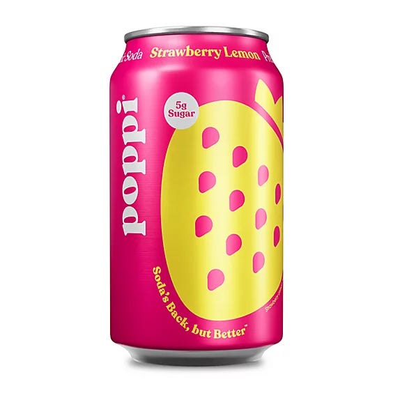
Then I used this prompt:
@Higgsfield
Using the uploaded product image, create one 20 second video, 16:9, in a natural UGC style for Poppi: a single story in three scenes, cut together, filmed as if by a real person talking to her phone at arm’s length. Handheld, slightly imperfect framing, hard midday sun with a little flare, bright pastel surfaces, no studio lighting, no colour grade.
Keep the can identical through the whole video. Same flavour, same label, same colours as the uploaded image. Do not redesign it and do not add text to the packaging. The same woman throughout: mid twenties, dark hair tied up, gold hoops, white tank top, coral nails. She talks straight to camera, casual and a bit amused, and her lips match the words.
Scene 1, the swap, 0 to 7s. She opens a fridge in a sunny kitchen, hand on an ordinary cola: “Okay, this was my 3pm every day.” She takes the Poppi from the shelf instead and holds it up: “Now it’s this. Prebiotic soda, twenty-five calories, five grams of sugar.”
Scene 2, the pool, 7 to 14s. Hard cut to her at a pool edge, pulling the same can out of an ice bucket, water dripping: “Took the whole fridge outside.” She cracks the tab, fizz over the rim, laughs at the spray: “Every single time.”
Scene 3, the sip, 14 to 20s. Close on her, sunglasses pushed up, she sips: “Swap your soda. That’s literally the whole pitch.” She turns the label to camera, condensation running: “It’s on the can.” Ends on the label filling the centre of the frame, her face beside it.
Across the video: her voice on the phone mic with the real sounds around it, fridge door, ice, the tab, fizz. Two hard cuts only, between the scenes; no transitions, no zooms, no speed ramps. No music, no voice-over, no subtitles, no on-screen text, no logos other than the product’s own.
First, it gave me 3 different videos, then put them together in a UGC video:
2. Launch map
I was struggling here to find the business I could test this on. Why the Apple Store? I didn’t want to do something related to real estate, but that’s probably where you can use it most. If you’re selling a listing, you can show, with a video, pretty quickly and in a good way, how far it is from school, from the hospital, from grocery stores, and so on.
I chose the Apple Store because it’s maybe what marketing brands are also doing.
I uploaded a photo of a storefront and used this prompt:
@Higgsfield
Create a 15 second video, 16:9, in a clean modern map style.
Start on the uploaded photo of the Apple Fifth Avenue glass cube at 767 Fifth Avenue, New York, filling the frame.
0 to 4s: the camera lifts and pulls straight up from the cube, the perspective flattening into a top-down map view in the style of a satellite map with soft muted greens, greys and sand tones. The cube stays centred as a small white square with a thin dark outline around its plaza, with room in the wider frame on both sides.
4 to 8s: the view zooms out. A pin drops onto the 5th Avenue–59th Street subway station to the northeast with a soft bounce and a label reading “5 Av–59 St”. A thin line draws itself from the plaza to the station along the pavement, one segment at a time, ending with a badge reading “1 min walk”.
8 to 12s: the walking route fades out. A second pin drops on Grand Central Terminal to the south with a label reading “Grand Central”. A slightly thicker line draws along the avenues from the terminal to the plaza with a small car icon travelling along it, ending with a badge reading “8 min drive”.
12 to 15s: the camera holds on the full map with both pins and the cube visible across the frame, with the edge of Central Park in the top of the frame, then eases in slightly.
Style: clean, premium, minimal. Soft daylight. No text other than the two labels and the two time badges. No people, no logos, no watermarks. Smooth easing on every animation.
Here’s the final result:
Type the real times in yourself. If you leave them out, the model makes up times that look right.
3. Walkthrough
This one was focused on real estate listings.
The problem I had was finding the listing that has all the pictures: the entrance, the living room, the kitchen, the terrace, bedroom, bathroom, and so on. I spent, let’s say, 10 to 15 minutes looking for the right listing.
Then I put all the rooms I wanted in the video into the model and played around with a prompt:
@Higgsfield
Create a 20 second video, 16:9, that looks like one uninterrupted handheld POV walk through a house, filmed on a gimbal in a single take. Use the seven uploaded listing photos as the reference for every room, material and colour; do not invent rooms that aren’t in them. The camera is at eye height, roughly 1.6 metres, and never stops moving: it walks forward at a calm, even pace for the full 20 seconds, turning smoothly to change direction, and every room is entered by walking through its doorway on screen. Wide lens with the mild fisheye character of a 360 camera, but a normal flat frame. Path:\
0 to 4s, starting just inside the front door, walking forward across the foyer tile, the curved dark-wood staircase with iron balusters passing on the left, the monstera and white console on the right, the camera turning right toward the open arch ahead.\
4 to 8s, walking through that arch into the living room without slowing, the white fireplace and TV coming into view, the two green armchairs passing on the right, the camera turning left toward the kitchen opening beside the staircase.\
8 to 12s, walking through the opening into the kitchen, along the granite island on the left with the three pendants passing overhead, the dark cabinets and stainless fridge on the right, the camera turning right toward the wide arch into the family room.\
12 to 16s, walking under that arch into the family room, the double-height windows and brick fence rising on the right, the white sofa passing on the left, the camera turning left toward the hallway door.\
16 to 20s, walking through the door into the master bedroom, the octagonal tray ceiling and fan overhead, the bed passing on the right, straight on through the open bathroom door, slowing to a stop only in the last second, facing the corner tub and the glass block window.
Style: warm afternoon daylight, natural shadows, cream walls, dark hardwood and pale stone-look tile exactly as in the photos, no relighting between rooms. No people, no pets, no reflection of a camera operator. No text, no captions, no logos, no listing overlays. One continuous shot: no cuts, no dissolves, no fades, no jump between rooms, no change of pace; the doorway is always visible as the camera passes through it.
Here’s the result:
If I spend more time, the video would probably be even better.
4. Product build
This one is pretty good, and that’s why I love the Higgsfield plus Astra combination. When I take a picture of a product, a Jordan sneaker in this case, the model is so capable that it does not change the product at all.
Of course, I use my prompt at the end of each session when I’m doing images and videos:
Don’t change the product at all. Don’t change the logos. Don’t change the colours. Just put it in the right atmosphere.
Here’s the full prompt you can reuse:
@Higgsfield
Create a 20 second video, 16:9, showing the uploaded [product] assembled from its parts into the finished product in one continuous shot.
The camera stays completely still from 0 to 16s on a plain [colour] backdrop. Each part grows into place, it doesn’t snap.
0 to 2s: empty backdrop, a soft shadow where it will stand.
2 to 16s: [the parts, in the real order the product is made, two seconds each].
16 to 20s: the camera orbits the finished product and ends on its best angle.
Identical light across the whole build. No hands, no tools, no text.
Don’t change the product at all. Don’t change the logos. Don’t change the colours. Just put it in the right atmosphere.
You should get a similar result:
5. Explainer
The hair transplant took me the most, because I didn’t know what process I could show.
I would show this to a clinic. It’s especially useful for new patients who don’t know what the procedure looks like, what’s happening during it, or how long it takes. It explains, at a typical patient level, what’s happening and what they can expect. Plus, the doctor can be there, explaining the video himself.
Reuse this prompt on your case:
@Higgsfield
Create a 20-second video, 9:16, as a clean animation of [the process], one step at a time. Calm, precise, no photorealism.
Use the uploaded illustration as the reference for every stage: same style, same colours throughout.
0 to 4s: [step one]. 4 to 9s: [step two]. Keep going, one step per beat.
17 to 20s: pull back to the finished result and hold.
Flat illustration, soft even light. No real patient, no face, no claims about results. No text except one short caption.
My input was only this photo, which was really not the best. If I had used a better process explanation photo, the result would be even better.
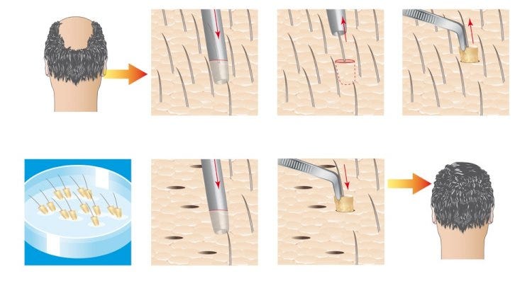
And this was the final result:
Where it went wrong
Mostly with the last example, the hair transplant.
You really need to put in the right picture, the right process, the right illustration. Same as with all the other tasks: if you don’t put in good input, the output’s gonna be bad.
What it costs
Not sure, to be honest. I ran out of credits in a week because I was testing so much, so it wouldn’t be right to say how many credits I actually spent.
It was definitely worth it. Each time a new model comes out, I try to test it in as many ways as possible: on everyday tasks, on clients’ tasks, and so on. So I can see what it’s capable of, and what I can do better, quicker, and of course cheaper with it.
That’s why I always run out of credits when a new model comes out.
Which one to try first
It depends on the industry you’re in and what you’re trying to say to the clients.
For most brands, the UGC ads will be most useful. For real estate agencies, the walkthrough or launch map. For brands in general, the Jordan build. The hair transplant for more complex services or products.
Even IKEA could put the paper instructions in a video.
The full prompts
The full prompts are in the Secret Stack. It’s free when you subscribe, and the link is in your welcome email.
See you next week,
Aljaz